MAKE YOUR MODERN | Timber's Condo
Dan and Jane have been long term clients and friends having initially bonded over modern design and midcentury styling many years ago. We have guided them through a few moves and have enjoyed watching them artistically alter each property leaving it cleaner and cooler than it had been prior to their ownership. Their latest home is an elevated condo in the Timbers of North Asheville. Originally, these were designed in the 80’s by local architect Larry Traber. His focus was on capitalizing on the natural wooded landscape around them. Today, given their generous floor plans, convenient location in North Asheville and their relationship with nature there is a great interest in this the community there. We had watched and looked at the units there for at least a year before deciding on this one. The scale, location and custom spiral staircase made this one the right decision.
The central living space centers around that beautiful, wood spiral staircase which is topped by a colorful landscape by late Asheville artist Wendy Whitson. Apparently, the staircase was original to this one unit only and was custom made for the original owners. Truly, the scale is perfectly balanced. From there you are surrounded by mid-century furniture icons such as recovered Adrian Pearsall chairs and an Alvar Aalto stool. The window niche in back holds Jane’s father’s original Eames lounge chair.
The living space has a vaulted ceiling and many windows to keep it open and light. The previous owner’s taste was a bit more traditional in styling. Together, with the 80’s textured ceiling the space had more weight. Dan and Jane chose to lighten and brighten everything. They had all the textured ceilings removed from the 3000 sqft space. They added a beam to the ceiling to add sublte architecture with a nod to mid-century post and beam styling. The floor finish was lightened and softened to a more matte finish followed by painting everything in Sherwin Williams Soft White with Benjamin Moore paint. Heavy drapery was traded for light controlling blinds that tucked away as needed.
the Dining Area
Removing the traditional built in side board and pendant light fixture was the first move in lightening the dining area. Here they choose a Nelson Propeller Bubble Lamp. Their dining set was passed down from Jane’s mother and is an original Paul McCobb. The table has several leaves to proportional host 4 people to 12. The sideboard is from the 60’s by G-Plan produced in Great Britain. They are fans of local fabric craftswoman Barbara Zaretsky and have several of her calm, modern pieces through out their home.
the Kitchen
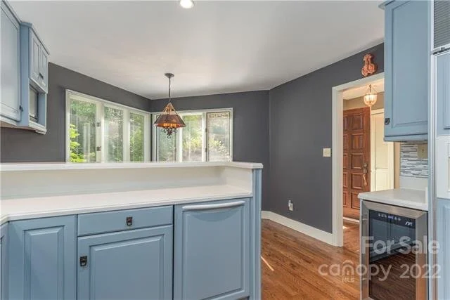
The original kitchen had a two layered breakfast bar that created a barrier in the smaller eat in space. Once that was removed they were able to reconfigure the surrounding walls for better function and more openness. Again, going after that Mid-century styling they worked with Heritage Kitchens to layout and contract the kitchen work. The cabinets were ultimately built by Omega Cabinets and topped with a clean quartz countertop. A simple horizontal line frames the uppers giving them a floating feeling. To ad that sparkling midcentury touch they ordered the appropriately named “Atomic Blend” from modwalls. The dining area is anchored by Noguchi Cyclone table creating a calm place to watch their bird and bear neighbors pass by.
the Primary Bathroom
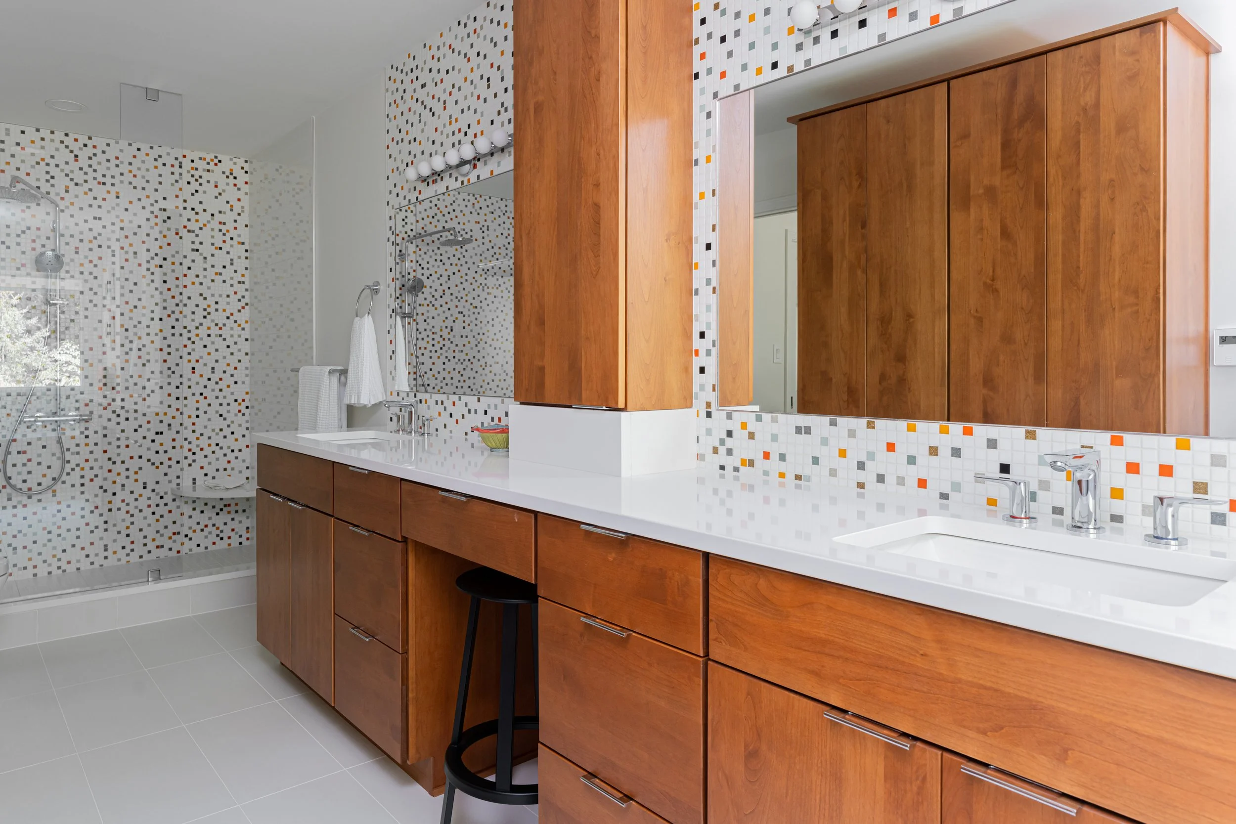
In the primary bathroom there was initially a debate on trying to salvage the grass cloth which we all loved, but the extent of the renovation made that impossible. They do plan to add some back into the interior when appropriate. The goal was to add that mid-century sparkle and brightness some of us remember as a child. Mod Tiles, once again, provided that through out the bathroom. As with most modern design homes similar materials are used throughout to create a more simplified living experience. The boxy jet tub was removed and replaced with a freestanding one. Counters and walls lightened to that same soft white. Unseen is a frosted glass panel replaced a solid wall as a screen to the toilet.
the Outdoor Living Space
The main level outdoor living is both covered and uncovered as are most condos in the complex. Dan and Jane carefully appointed their patio with appropriately scaled pieces with light profiles to keep the air flowing and the space light so nature and the mountain view remained the star of the show.
It has been a fun journey playing along with Dan and Jane from home to home. Through them we have witnessed how modern and mid-century styling can live in a cabin, a craftsman home and contemporary condo spaces. It all has worked beautifully having been meticulously curated by them. We appreciate your eye — your gift. Cheers to you!
Looking to Make Your Modern? With our vision and real estate knowledge let us help. Cheers! Kelly and Troy


