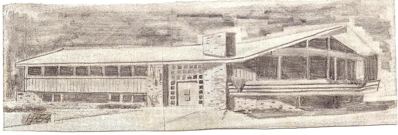
Asheville Citizen Times - 1960's House of the Week
Thanks to my friend and fellow mid-century enthusiast, Steven Chicurel, and his savvy scrapbooking skills I am recreating this article from the Asheville Citizen Times for their House of the Week. I immediately recognized the home as 4 Crowningway which I have toured. The plans and windows have been modified slightly from what was published. Notice the images from the original article in the 60's and a few of my photos from two years past when this cool pad was on the market. Following is the original article. Realtor's take note on some past room lingo! Angled Styling Features Raised Ranch The split entry or raised ranch is a favorite with architects and home buyers who like a style that permits considerable flexibility of design.Architect Rudolph A. Matern has utilized this available flexibility in his latest creation for House of the Week. Contemporary styling takes over in this unusual home, with the right side turned at an angle for dramatic effect, yet with no loss of practicality for gracious, large family living. It is impossible to view this house, either from the outside or the inside without being impressed by the striking placement of its components.Although its over-all dimensions are a modest 71' 2" by 36' 3", it is a five-bedroom, three bath house with an amazing 2977 square feet of living area, not including a spacious deck porch, two other porches and the two-car garage. And because of the raised ranch design, the lower level -- with its huge family-recreation room, two bedrooms, a batha nd a laundry room -- is higher than a basement, has larger windows and gets more sunlight.The boldness of design applies to more than the angles plane. Note the impressive front entrance, with glass squares surrounding the door; the prow-shaped deck porch; the similarly-shaped living room with almost an entire wall of sliding glass; and the upper level reception hall, excellent as a guest introduction area. And see how the garage is invisible from the front, its two windows blending in perfectly with the rest of the house. The circulation is good and well-controlled from the flag-stone foyer to either level. An open balcony at the stairs adds a touch of elegance. Besides the previously-mentioned 18 feet of sliding glass, the living room has a large fireplace just off the reception hall. From this area it is easy to move out to the large deck porch at the front or, through the dining room, to the smaller deck porch at the rear, also accessible through sliding glass doors. The living room ceiling is the cathedral type which follows the underside of the rafters.What lady could resist a kitchen 20 feet long, with every conceivable modern appliance? And there's a curved wall at the second stairs in the house around which another open balcony is designed. The master bedroom has a bath and shower, a walk-in closet, two other closets and a handy vanity section. Another bath is conveniently located between to two other bedrooms. There are two linen closets in the hall.Two more bedrooms are on the not-so-lower level, with a third bath nearby. The family that lives in this house will never lack for plenty of recreation space. Not only is the family-recreation room a whopping 26' by 19', but there is an additional relaxation or what-have-you area on the adjoining sunken porch. A large storage room also adjoins the recreation room.The two-car garage is wide enough to include a workshop and two separated storage areas. All in all, Design H-54 must be considered a house with plenty of space for a large family as as one with extra special styling.


