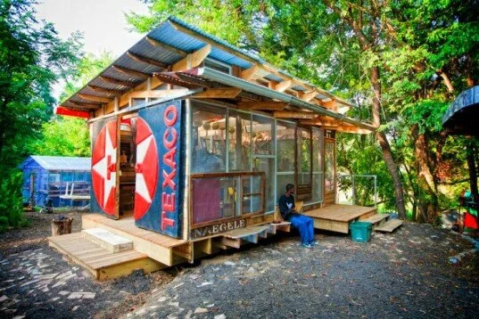
A Learning Center made of Recycled Materials I wanted to take a moment to give my kudos to all those involved in this project. A wonderful grass roots local project worth highlighting. See this article by Bridgette Meinhold of Inhabitat. Enjoy!
Game-Changing Green Advancements You Should Know About I just read an article from the Huffington Post and had to share a portion of it. They showcased 7 items in the works for Green Advancement worldwide. Here are four that particularly caught my attention. I am especially excited about the green concrete.Concrete might not seem un-green at first, but it's actually the third largest source of man-made carbon dioxide! However, several companies are working on changing that. Enter "green concrete," which not only makes concrete carbon-neutral but even turns it carbon-negative. CO2 absorbing concrete is nothing short of a game-changer.This isn't a ferris wheel, it's the LO2P: Delhi Recycling Center, a concept by firm Atelier CMJN. Built from parts of recycled cars from local junk piles, this novel greenhouse has wind turbines that serve as bio-lungs. While it's still just a concept, it won first place in this year's eVolo Skyscraper competition, which means that the greenest buildings of the future will be of an entirely different ilk than we're used to.When it comes to green, bigger is almost never better. In that spirit, a new generation of homeowners and homebuilders are focusing on living in tiny eco-friendly homes. Gone are expansive kitchens and bedrooms; instead the focus is on integrating your life as much as possible with the outdoors, and winnowing down your lifestyle in size but not in style. Indeed, many of these tiny homes are very design-focused.Forget green building--consider entirely green cities. Tianjin Eco-City in China, slated for completion in 2020, will span 30 square kilometers and will include "an advanced light rail transit system and varied eco-landscapes ranging from a sun-powered solarscape to a greenery-clad earthscape for its estimated 350,000 residents to enjoy."
PCB&L Architects reconstruct ABC's Brand Identity I have been enjoying the three new ABC Stores popping up around Asheville in the last year. My jaded, winter outlook of late has been warmed by the progressive nature of the sunny, new design from a government agency. It is refreshing to see such thoughtful construction in the context of the commercial strips of Tunnel Road, Leicester Highway and elsewhere. The modern composition and rhythmic nature of the facade, including the new brightly colored graphic, is not only elegant, it honors the nature of how you experience it from the automobile. The entire facade serves as memorable and well branded sign for speedy travelers negotiating traffic and other commercial entities of our mountain version of the American commercial strip.Curious to know how this came about I met with architect Richard Fort of PCB&L Architects in downtown Asheville. Richard was the lead architect on the three new buildings. The architecture company was hired to design both the building and to develop the branding and supporting graphics. Richard stated that the Asheville ABC Board was indeed progressive in their thinking. They realized that their old stores were as unwelcoming as a dirty adult bookstore and were a deterent to the everyday female shoppers they were now aggressively trying to market. As I know from real estate 80% of home buying decisions are made by women along with purchases for the home. In an attempt to expand their market and create a more welcoming environment for all consumers they wanted a more open, well lit and transparent shopping experience. Now isn't that nice.Another important point was that the retail building was designed and built on a very tight budget. The design firm fought to keep key materials such as the contrasting bricks in place and worked to balance the design budget in other ways. This goes to show you that economic commercial buildings don't have to be done in synthetic stucco and plastic windows. With appropriate and professional design planning you can have a sophisticated building that stands out, surpasses your neighbors and is openly sexy. Thank you Asheville ABC board for your progressive strategy and PCB&L for your mindful stewardship of your clients vision and brand. We all benefit from your refreshing collaboration. Admittedly, I write this while sipping on a glass of Sky ginger vodka that I could not resist buying while photographing the interior. Not feeling naughty enough I am deviously hopeful my purchase bought a nice, deep grey brick for another ABC Store somewhere in the future.Article and Photographs by Troy Winterrowd


