Posts in Commercial
UNCA Architecture Tour | Lipinsky Hall

Built in 1964 | Designed by Six Associates

This building was constructed as the campus's first student union. The hall was named for local businessman and community leader Louis Lipinsky. A trustee of Asheville-Biltmore College, A UNC Asheville predecessor institution, Lipinksy was instrumental in generating support for the 1958 and 1961 bond referenda which funded the move from Seely's Caslte to the present site of the campus.

A special thinks to Kevan from Asheville By Foot for my personal tour of UNCA and helping gather information on the campus. Cheers!

— Troy

UNCA Architecture Tour | Justice Center

Built in 1963 | Designed by SIX ASSOCIATES

Justice Center was named after Charles "Choo-Choo" Justice who began his extraordinary football career on the Asheville High football team. After serving in World War II, Justice was an all-American at UNC Chapel Hill and went on to play for the Washington Redskins. The Justice was named for the outstanding local athlete in 1973, 10 years after the buildings construction.

A special thinks to Kevan from Asheville By Foot for my personal tour of UNCA and helping gather information on the campus. Cheers!

— Troy

New Industrial Meets Green
Hendo 01

Hendo 01

Hendo 02

Hendo 02

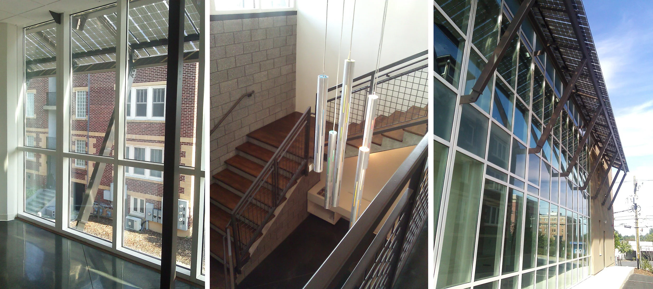
Yesterday, I was invited to tour Biz611 in Hendersonville with Architect Ken Gaylord, a fellow AIA member. It is a newly opened office building in downtown Hendersonville that was designed to house selected, start up technical companies. The owner/developer of this small office building was very focused on green design and that it be evident throughout the building. Ken and his team were brought in to make his vision reality in this industrialized modern construction.The facade was veneered with bricks retained from buildings torn down from the site. Also, it incorporates living walls with plants as shown above. The South wall incorporates a shade structure that simultaneously harnesses solar energy. The interior consisted of recycled walls from a bank in Charleston along with reclaimed glass, wood and even railings used to cover water retention areas externally. For an expanded photographic tour of this building click here.

Echoes of Mies Van Der Rohe
north-west-bank-1965

north-west-bank-1965

In light of the announcement that the BB&T building will be repurposed and remodeled, I thought it would be appropriate to pull this article out of the archives. In the attached video, local architect Mark Allison gives context to the architecture of the building in relationship to both other cities and Asheville itself. Enjoy! A Commentary on the BB&T Building in downtown Asheville.  Local Architect Mark Allison was generous enough to send me his new video commentary on the BB&T Building. Enjoy this interesting history into the architectural influences of Mies Van Der Rohe. The BB&T Building was completed in 1965 as the headquarters for North Western Bank.  It is 18 stories, was built by George Goodyear and designed by D. Gene Whittington. The BB&T building reflects the International style of Mies Van Der Rohe.  Mies's thirty years as an American architect reflect a more structural, pure approach towards achieving his goal of a new architecture for the 20th Century.  He focused his efforts on the idea of enclosing open and adaptable spaces with clearly arranged structural frameworks, featuring pre-manufactured steel shapes infilled with large sheets of glass.  His early projects at the IIT campus and for developer Herb Greenwald opened the eyes of Amercians to a style that seemed a natural progression of the almost forgotten 19th century Chicago School style.  His architecture with origins in the German Bauhaus and western European International Style became an accepted mode of building for American cultural and educational institutions, developers, public agencies, and large corporations. The BB&T building does not live up to some key design principles of Mies as Mark will point out in his video. Thank you Mark. Photo courtesy of the Pack Memorial Library

ABC Stores go from Naughty to Nice

PCB&L Architects reconstruct ABC's Brand Identity I have been enjoying the three new ABC Stores popping up around Asheville in the last year. My jaded, winter outlook of late has been warmed by the progressive nature of the sunny, new design from a government agency. It is refreshing to see such thoughtful construction in the context of the commercial strips of Tunnel Road, Leicester Highway and elsewhere. The modern composition and rhythmic nature of the facade, including the new brightly colored graphic, is not only elegant, it honors the nature of how you experience it from the automobile. The entire facade serves as memorable and well branded sign for speedy travelers negotiating traffic and other commercial entities of our mountain version of the American commercial strip.Curious to know how this came about I met with architect Richard Fort of PCB&L Architects in downtown Asheville. Richard was the lead architect on the three new buildings. The architecture company was hired to design both the building and to develop the branding and supporting graphics. Richard stated that the Asheville ABC Board was indeed progressive in their thinking. They realized that their old stores were as unwelcoming as a dirty adult bookstore and were a deterent to the everyday female shoppers they were now aggressively trying to market. As I know from real estate 80% of home buying decisions are made by women along with purchases for the home. In an attempt to expand their market and create a more welcoming environment for all consumers they wanted a more open, well lit and transparent shopping experience. Now isn't that nice.Another important point was that the retail building was designed and built on a very tight budget. The design firm fought to keep key materials such as the contrasting bricks in place and worked to balance the design budget in other ways. This goes to show you that economic commercial buildings don't have to be done in synthetic stucco and plastic windows. With appropriate and professional design planning you can have a sophisticated building that stands out, surpasses your neighbors and is openly sexy. Thank you Asheville ABC board for your progressive strategy and PCB&L for your mindful stewardship of your clients vision and brand. We all benefit from your refreshing collaboration. Admittedly, I write this while sipping on a glass of Sky ginger vodka that I could not resist buying while photographing the interior. Not feeling naughty enough I am deviously hopeful my purchase bought a nice, deep grey brick for another ABC Store somewhere in the future.Article and Photographs by Troy Winterrowd