Posts tagged town mountain
FOR SALE | Town Mountain Mid-Century

4 Bedrooms | 2 Baths | 2,932 sqft | .52 acre mountain view lot

This is the quintessential mid-century modern masterpiece you've been waiting for. The J. Bertram King designed home {original architectural drawings included} was built in 1963 and sits gently perched in the mountains above Asheville. The home has dramatic views while remaining highly accessible. Experience the unique architectural entry sequence from exterior walkway in thru the cool interior entry vestibule with stone flooring, custom stair rail and original light fixtures. The vaulted and light filled main level flows easily from living room to the master suite. 3 Bedrooms and Family Room on Lower Level for family, guest rooms, offices or studios -- the ultimate in versatility! On top of being everything you need it is inspired living by design. And the coolest!

Give the Modern Asheville Real Estate Team {Kelly, Troy or Amanda} a call for more information and a tour today. Until then enjoy the full photo tour here. Cheers!

the Aleph house

Recently Published on Dwell Online

Once again I found more quality Asheville design work featured in DWELL online. Just recently there was a brief on the Aleph house by SAI Design. To see the recent post go here. Browsing through it reminded me of the personal tour that Kelly and I went on with designers Michael and Elihu back in late 2011. It inspired me review the article I had first featured on the home and decided to reshare today. Enjoy it and enjoy your beautiful Sunday. Cheers!

January 2012 Article on Modern Asheville

“The only place on earth where all places are --- seen from every angle, each standing clear, without any confusion or blending”

The above quote was written by Jorge Luis Borges regarding the first letter of the Hebrew alphabet and is our starting point in viewing the development of this thoughtful new home resting just below Town Mountain Road co-created by SAI Design and the adventurous owners. While there are many grounded realities that go into a sophisticated construction as this, equally, there are abstract notions that layer in meaning and spirit that give this home a rich, rooted history long before moving day arrives.

The Aleph is a silent letter quietly representing strength, humility, creation and the first breath. Placed on the site it represents where the topographical elevations of the earth meets the air coming up the hill. It is the point where the two distinctly marry.

The owners, a married couple, also bring together the two distinct elements of wood and clay. Both craftsmen, one is a woodworker while the other a potter. Wood and earth are mixed in and help shape the spatial organization of this home. The upper volume contains the more public “living” spaces is light, clad in wood and adjusts its angles to the views and to embrace the energy of the sun. Dramatically, it cantilevers out into space supported by the lower volume that hugs tightly to the earth. This volume clad in stucco and cement board houses the “private” spaces including studios and bedrooms. As you walk around the house, Jorge’s notion of the Aleph becomes clear. This was a place on earth where all places are represented, seen from every angle and remain clear of confusion.

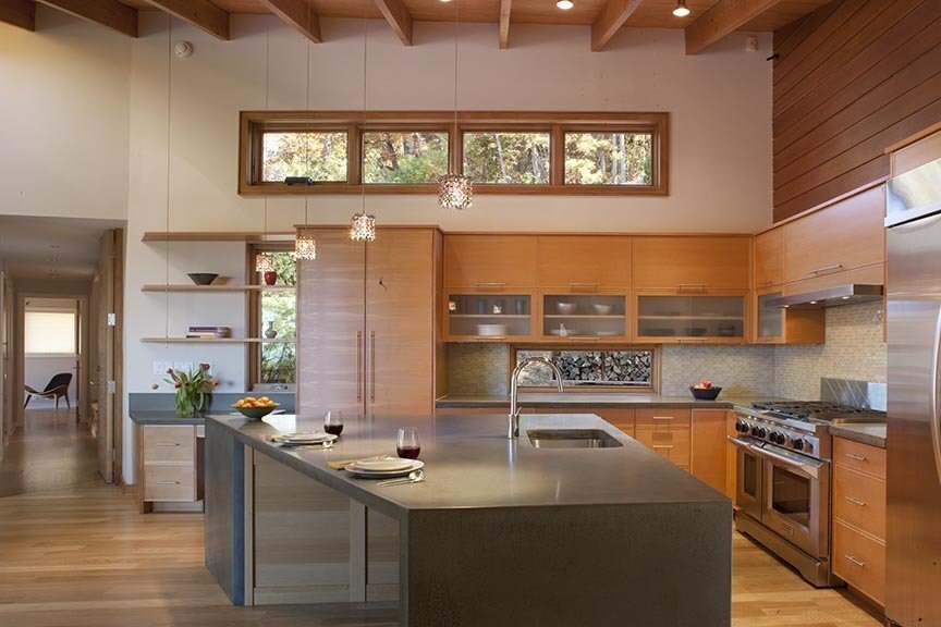
aleph-residence-dining-area-asheville-nc.jpg

This artful, architectural stew was expertly guided and stirred over a period of two years by Michael Silverman and Elihu Siegman of SAI Design. Given plenty of simmer time, the rich design evolved organically working back and forth from client to architect and from careful thought and functionality to artistic intuition. While your average builder might look at the specific site, common to Asheville, and see its limitations and standard outcome this team saw it as a creative springboard for achieving something unique. The home is a balance of being nestled into the hillside to minimize the visual impact while cantilevered to minimize the impact on the ground. Trees from the site were recycled into the house mill work and floors, not uncommon to resource minded mountain dwellers of Asheville. For me, part of the strength of the home lies in its founding design principles of being site specific in both layout and materials. The notion is explained above, however you simply have to experience the house to know that it just feels right.

The home is 3100 sq.ft with three bedrooms (one bunk room for multiple guests) and three baths. Both the private and public entry is on the main level anchored by a generous storage, utility and laundry area. Beyond is the great room which is dramatic and simple featuring custom crafted details in wood and concrete.

My favorite spot is standing at the top of the stairs where you can view the entire restful and rhythmic living space while at the same time uncover clues about the rest of the house thru inviting views down corridors in two directions  and down the Escher-like stairs to the lower level. The generous landing area on the lower level neighbors a media room with built-ins flanked by the owners studios with indoor-outdoor work spaces at either end.

Overall, the Aleph House makes sense with its carefully crafted and functional layout. Like the Aleph, it has a humility in its simple, shaker-like utility. Yet, it is layered with quiet sophistication  that makes it rich without ever having to know why. The quality home will undoubtedly endure generations of both well grounded and inspired inhabitants and Asheville will benefit from a richer compost of thoughtful modern design. Great job guys!

Photos by David Dietrich

MAKE YOUR MODERN | Bringing a Bert King Contemporary into 2011
Ext. with Border

Ext. with Border

356282

356282

Entry comp

Entry comp

Kitchen Comp

Kitchen Comp

Living Comp

Living Comp

Back with Pool

Back with Pool

I recently toured 10 Crowningway in one of my favorite Asheville neighborhoods, Sunset Summit, just off Town Mountain Rd. The current owners, Bradley and Peggy Holmes, purchased the 1964 built, Bert King home in 2006. Having lived in it for a few years they were slowly exploring renovating the home when a pipe burst causing extensive damage and forcing them to seek repairs. This presented the opportunity to expand and bring the house into the future at the same time.As I pulled into the drive of the home I did not recognize it from the photos as I had found from its 2006 MLS listing. It was similar, but not the same house. I pulled out again to check the address. This was it. The confusion stemmed from the house looking so originally 60’s that I thought I was at the wrong house in the same neighborhood of mid-century homes. The house had seamlessly been altered within its original aesthetic. The owners had been careful to match the original wood siding and other appropriate details.  Cool! Mid-Century MakeOvers - Allow me to pause and make a point here. You will often see around the country and in Asheville mid-century and ranch homes that get a traditional makeover by their owners and become a mix of conflicting styles. In Asheville you will witness many being “dragged out” in craftsman style garb such as windows, doors and siding. The end result is conflicting and uncomfortable and often times challenging to sell. I find that maintaining the homes true nature is the best way to go long term. Let's look at people as an analogy. We have all watched those make over shows where they find people who are 40-something trying to wear clothes of a 20 year old, a man trying to hide his balding head with a come-over or a woman trying to shove her breasts into a shirt that is way too small. Without fail the fashion expert will make them over wearing clothes that fit their true proportions and nature, age appropriate and working with their natural bones. In the end they look more fashionable, approachable and walk with more integrity by doing less. The same is true of a house. You don’t have to be a designer to know that it just feels right. Keep it simple and work with what you have. In continuing with my tour I found that the entry space was the most visible, but subtle departure from the original styling. The contemporary slat wall was crafted by a local artist, Craig Wies, using slats of rich Walnut. The choice was a personal statement and reflection of Brad’s upbringing in Pennsylvania and memories of building family homes using walnut off the land. To avoid isolating this feature they tied the wood into the entry flooring and the cap to the kitchen cabinetry.Originally, the home had no internal stairs to the basement. In removing the flooded and damaged laundry from this area and expanding it in the front they created an expansive entry and circulation area. As I toured the bedroom wings there was mention of the house having been expanded in one area to allow for a closet and other closets and doors being rearranged. If they hadn’t told me I would have thought it was all original. Again, it was seamless in its updating. This played out further in the den. Despite closing off an entry to the living space and rearranging a closet they were able to salvage all the paneling and place it back. The warm wood maintained the integrity of what was appropriate to the period and lifestyle keeping the contemporary and cozy feeling of the room while adding a needed third bedroom to the home.Overall, the house was clean, open and comfortable like most of the Bert King homes I have been in. I can’t say much more than they just feel right. Peggy states, “Some architects bring the outside in, but she feels that Bert King's designs really bring the inside out.”  They definitely balance function and flow and make for a quality livable home for generations. Just ask the Holmes who plan to live a quality life in their own for many years. I commend them for their sensitve updating to this Bert King classic contemporary home and hope they inspire others to do the same.

SOLD - 175 Bent Tree
[444918] Dine Overlooking Downtown (666x500)

[444918] Dine Overlooking Downtown (666x500)

$1,485,675.00    4385 sqft.3 Bedrooms and 3.5 BathsListed by: Janet Whitworth

"Unrivaled views of Asheville and distant mountain ranges, yet five minutes to downtown.  A striking blend of Mid-Century Modern and Arts and Crafts architecture on beautifully landscaped 3.4 acres of rolling terrain.  Glass everywhere to enjoy views from dining, living, kitchen and upstairs master bedroom.  Outdoor living spaced include a covered porch, master bedroom balcony, screened porch.  Enjoy dining on the main level patio with huge sunset views."

Bent Tree Comp

Bent Tree Comp

Bent Tree View

Bent Tree View

This home built in 1960 was originally designed by Six Associates here in Asheville.  Over the years it has undergone some additions and updates designed by noted architect Robert Griffin.  I recently toured the home with Janet and found the blend between mid-century modern and contemporary arts and crafts to be quite seamless throughout the house.  Great care was taken to strike a thoughtful and harmonious blend between the styles which makes it unique in itself.  For a bit of history on the home please find my article titled "Blast from the Past - Year 1960".To view this property's website Click Here! To view this property's virtual tour Click Here!