Posts in Modern Architecture an...
70's Style Mountain Cabin

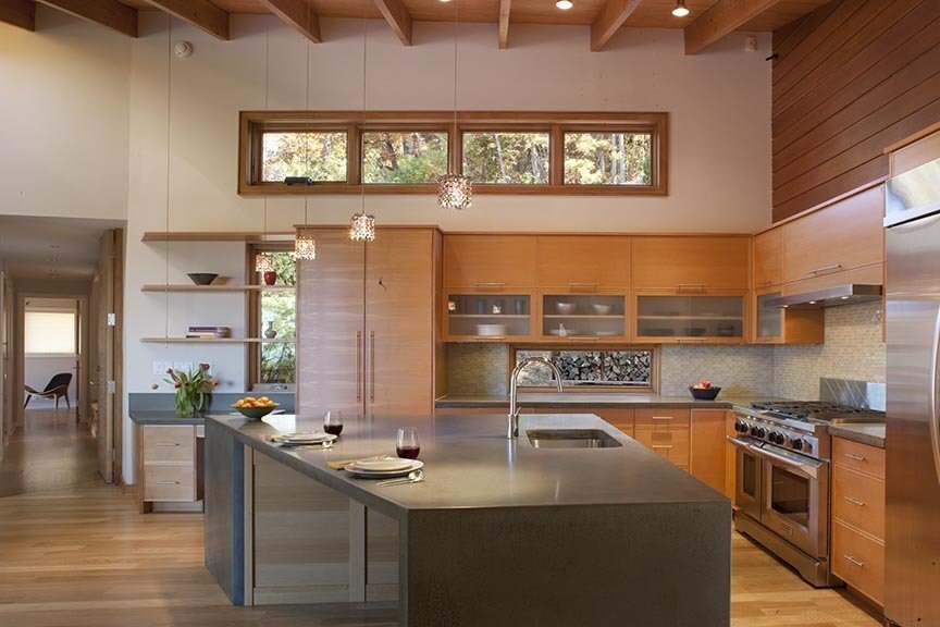
Kelly and I toured this 70's contemporary home on Saturday with a couple of our modern clients. It has long been one of our favorites sitting just out of reach in the hills north of Grove Park Inn. The efficient home didn't disappoint given it's layered, experiential layout connecting private gardens, to living spaces to treetops and the Asheville city view beyond.

The architect, William Moore, originally built the home for himself and his wife in 1973. It was then constructed for $42,000. Moore was the designer for the Unitarian Church on Charlotte St near the Grove Park Inn.Southern Living Magazine originally published the design and plans of the home. Following, publication he sold plans to many others who wanted to create this simple living space for themselves. The home showcases one of his signature design features of a dominate roof. He told me, "Roofs are traditionally cheaper to maintain and replace." So he dedicates maximum square footage to the roof in containing interior spaces.

the Aleph house

Recently Published on Dwell Online

Once again I found more quality Asheville design work featured in DWELL online. Just recently there was a brief on the Aleph house by SAI Design. To see the recent post go here. Browsing through it reminded me of the personal tour that Kelly and I went on with designers Michael and Elihu back in late 2011. It inspired me review the article I had first featured on the home and decided to reshare today. Enjoy it and enjoy your beautiful Sunday. Cheers!

January 2012 Article on Modern Asheville

“The only place on earth where all places are --- seen from every angle, each standing clear, without any confusion or blending”

The above quote was written by Jorge Luis Borges regarding the first letter of the Hebrew alphabet and is our starting point in viewing the development of this thoughtful new home resting just below Town Mountain Road co-created by SAI Design and the adventurous owners. While there are many grounded realities that go into a sophisticated construction as this, equally, there are abstract notions that layer in meaning and spirit that give this home a rich, rooted history long before moving day arrives.

The Aleph is a silent letter quietly representing strength, humility, creation and the first breath. Placed on the site it represents where the topographical elevations of the earth meets the air coming up the hill. It is the point where the two distinctly marry.

The owners, a married couple, also bring together the two distinct elements of wood and clay. Both craftsmen, one is a woodworker while the other a potter. Wood and earth are mixed in and help shape the spatial organization of this home. The upper volume contains the more public “living” spaces is light, clad in wood and adjusts its angles to the views and to embrace the energy of the sun. Dramatically, it cantilevers out into space supported by the lower volume that hugs tightly to the earth. This volume clad in stucco and cement board houses the “private” spaces including studios and bedrooms. As you walk around the house, Jorge’s notion of the Aleph becomes clear. This was a place on earth where all places are represented, seen from every angle and remain clear of confusion.

aleph-residence-dining-area-asheville-nc.jpg

This artful, architectural stew was expertly guided and stirred over a period of two years by Michael Silverman and Elihu Siegman of SAI Design. Given plenty of simmer time, the rich design evolved organically working back and forth from client to architect and from careful thought and functionality to artistic intuition. While your average builder might look at the specific site, common to Asheville, and see its limitations and standard outcome this team saw it as a creative springboard for achieving something unique. The home is a balance of being nestled into the hillside to minimize the visual impact while cantilevered to minimize the impact on the ground. Trees from the site were recycled into the house mill work and floors, not uncommon to resource minded mountain dwellers of Asheville. For me, part of the strength of the home lies in its founding design principles of being site specific in both layout and materials. The notion is explained above, however you simply have to experience the house to know that it just feels right.

The home is 3100 sq.ft with three bedrooms (one bunk room for multiple guests) and three baths. Both the private and public entry is on the main level anchored by a generous storage, utility and laundry area. Beyond is the great room which is dramatic and simple featuring custom crafted details in wood and concrete.

My favorite spot is standing at the top of the stairs where you can view the entire restful and rhythmic living space while at the same time uncover clues about the rest of the house thru inviting views down corridors in two directions  and down the Escher-like stairs to the lower level. The generous landing area on the lower level neighbors a media room with built-ins flanked by the owners studios with indoor-outdoor work spaces at either end.

Overall, the Aleph House makes sense with its carefully crafted and functional layout. Like the Aleph, it has a humility in its simple, shaker-like utility. Yet, it is layered with quiet sophistication  that makes it rich without ever having to know why. The quality home will undoubtedly endure generations of both well grounded and inspired inhabitants and Asheville will benefit from a richer compost of thoughtful modern design. Great job guys!

Photos by David Dietrich

UNCA Architecture Tour | Justice Center

Built in 1963 | Designed by SIX ASSOCIATES

Justice Center was named after Charles "Choo-Choo" Justice who began his extraordinary football career on the Asheville High football team. After serving in World War II, Justice was an all-American at UNC Chapel Hill and went on to play for the Washington Redskins. The Justice was named for the outstanding local athlete in 1973, 10 years after the buildings construction.

A special thinks to Kevan from Asheville By Foot for my personal tour of UNCA and helping gather information on the campus. Cheers!

— Troy

Mid-Century Drive By | Bert King's Poston House

I happened to be showing a property to one of our clients yesterday when I found myself in front of this beauty in the Grovewood Park neighborhood of Asheville. It is one of our team's favorites, but I don't often get to drive by it. NC Modernist Homes confirms it is a Bert King designed home. It is a few blocks away from Bert's own 1950's home on Country Club drive. Tax records show this one was built in 1954 for Ray and Francella Poston. The home is approximately 1958 sqft with 4 bedrooms and 2.5 baths with a rare flat roof. The home's original landscape was designed by Doan Ogden.

Cheers!

Modern Farmhouse: the Neathermead Residence
Neathermead Comp

Neathermead Comp

There have been many examples of modern interpretations of the farmhouse here in Asheville. Carlton's version, one of my favorites, just won a Residential Honor Award. Overall, the home is a well curated blend of traditional proportions and warm, homey materials mixed with clean lines and open living that offer the resident a modern lifestyle within a historic vernacular. Check out this brief video to see more details.

On a side note, a real estate colleague questioned my use of the term "vernacular." Instead of replacing it I thought it was a good opportunity for further understanding. I found this great article on ArchDaily that can give further insight.

Enjoy!

Troy

Calling All Modern Asheville Home Buyers
photo 4

photo 4

images

images

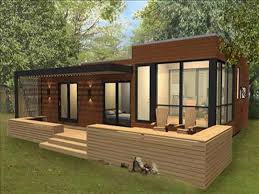
Your Information Needed Asheville Modern Home Seekers and other Brokers - I would appreciate your time and input to help influence future housing developments here in Asheville for two similar reasons. 1.  As housing exists today in Asheville, I believe we are missing inventory to meet specific buyer expectations for today. My frustrated clients would agree. Kelly and I are currently in touch with developers and builders for various locations including the River Arts District, a riverside just north of downtown and scenic mountain properties. I can’t give details, but they involve container housing, modular and site built, age-in-place, one level modern. I would welcome the opportunity to speak with you regarding your specific needs and desires to help get consensus as these properties go into design development. Let's avoid the arbitrary. Furthermore, I will create a mailing list for interested parties to keep you informed of future developments you might be interested in. 2. To further communicate what is missing, I'm putting together a lecture/discussion that is partially on what people are seeking as housing options in Asheville. This information will be used to help influence builders and designers regionally. As a designer/realtor myself I'm working to bridge the gap I see in today's Asheville housing stock. If interested, please email me at troywinterrowd@gmail.com and leave me with the best time and way to reach you. Help me - help you. Let's co-design and, literally, build a better future here in Asheville. Thank you,Troy(the above photos are representational only)

New Industrial Meets Green
Hendo 01

Hendo 01

Hendo 02

Hendo 02

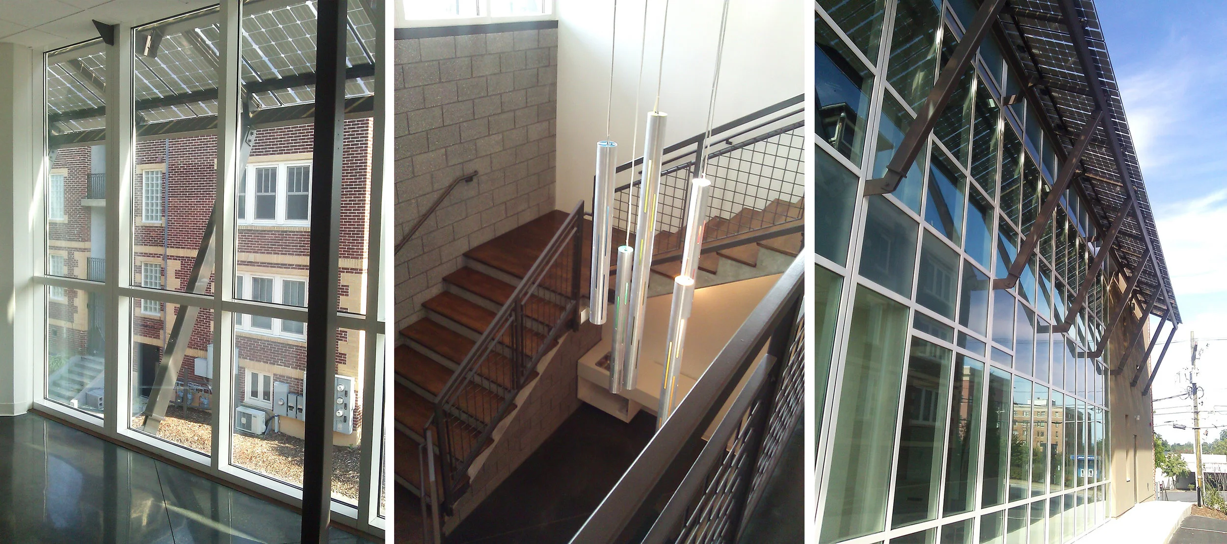
Yesterday, I was invited to tour Biz611 in Hendersonville with Architect Ken Gaylord, a fellow AIA member. It is a newly opened office building in downtown Hendersonville that was designed to house selected, start up technical companies. The owner/developer of this small office building was very focused on green design and that it be evident throughout the building. Ken and his team were brought in to make his vision reality in this industrialized modern construction.The facade was veneered with bricks retained from buildings torn down from the site. Also, it incorporates living walls with plants as shown above. The South wall incorporates a shade structure that simultaneously harnesses solar energy. The interior consisted of recycled walls from a bank in Charleston along with reclaimed glass, wood and even railings used to cover water retention areas externally. For an expanded photographic tour of this building click here.

Echoes of Mies Van Der Rohe
north-west-bank-1965

north-west-bank-1965

In light of the announcement that the BB&T building will be repurposed and remodeled, I thought it would be appropriate to pull this article out of the archives. In the attached video, local architect Mark Allison gives context to the architecture of the building in relationship to both other cities and Asheville itself. Enjoy! A Commentary on the BB&T Building in downtown Asheville.  Local Architect Mark Allison was generous enough to send me his new video commentary on the BB&T Building. Enjoy this interesting history into the architectural influences of Mies Van Der Rohe. The BB&T Building was completed in 1965 as the headquarters for North Western Bank.  It is 18 stories, was built by George Goodyear and designed by D. Gene Whittington. The BB&T building reflects the International style of Mies Van Der Rohe.  Mies's thirty years as an American architect reflect a more structural, pure approach towards achieving his goal of a new architecture for the 20th Century.  He focused his efforts on the idea of enclosing open and adaptable spaces with clearly arranged structural frameworks, featuring pre-manufactured steel shapes infilled with large sheets of glass.  His early projects at the IIT campus and for developer Herb Greenwald opened the eyes of Amercians to a style that seemed a natural progression of the almost forgotten 19th century Chicago School style.  His architecture with origins in the German Bauhaus and western European International Style became an accepted mode of building for American cultural and educational institutions, developers, public agencies, and large corporations. The BB&T building does not live up to some key design principles of Mies as Mark will point out in his video. Thank you Mark. Photo courtesy of the Pack Memorial Library

Carlton's Highland View Residence
Highland View Main

Highland View Main

Highland view right

Highland view right

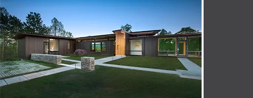
Asheville architect, Rob Carlton, and his team are competing in the Marvin Architect's Challenge Showdown with their Highland View Residence. Give them your support!Located in the foothills of the Blue Ridge Mountains, the residence overlooks a mountain lake with expansive mountain views beyond. The design ties the home to its surroundings and enhances the ability to experience both home and nature together. The entry level serves as the primary living space and is situated into three groupings; a great room, a guest suite and a master suite. A glass connector links the master suite while creating space for terrace and garden areas.To see more photos of this project and to vote click here.

Ranch-x-pansion
DSC_0018

DSC_0018

Elevation Before and After New

Elevation Before and After New

Evelyng Before and After Plan

Evelyng Before and After Plan

Details comp

Details comp

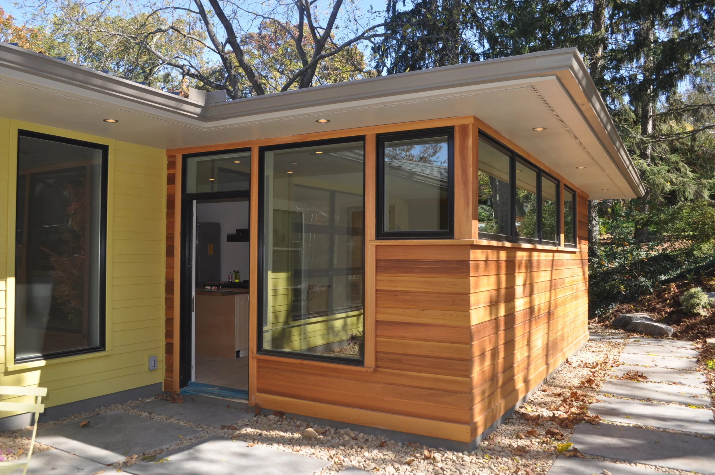
Brickstack + Bellwhether = Asheville-styled Modern Ranch Recently, I was able to connect with Scott Huebner of Brickstack A + D . Scott was brought in by Bellwether Builders to pull together the design vision for this ranch home expansion in the Grove Park Inn neighborhood of North Asheville. During the time of construction it was right around the corner from me so I was able to watch the progression and get occasional tours from Brad Rice of Bellwhether builders. The progressive owner's looked to Scott to guide the home back to its more modern roots. Through discovery it was found the house had been remodeled at least twice, disguising some of the more modern and horizontal lines remaining only in the fireplace and large picture windows on back of the house. In the process the home gained 2500 sqft of indoor and outdoor living space + garage to accommodate the client's growing family. The other criteria was that it be "fun" for their children. Overall, Scott thought the collaborative process between client and designer was synchronistic allowing for a cohesive team vision and construction.From my perspective the design is a thoughtful balance between the original mid-century atomic ranch and today's northwest modernism making use of earthy lines and materials. It seems to me a very Asheville appropriate ranch aesthetic and, overall, a successful investment given the neighborhood and view location. Great job to all involved.Yes - I'll say it again. We have well established, ranch neighborhoods here in  great locations. They are worthy of exploration for creating a modern lifestyle in Asheville. Take along a designer and work it out like Scott did.