Posts in Modern Architecture an...
Modern Inspiration | Five Retreats

Daily we receive inspirational feeds from various design and quality lifestyle sources. Here is something from our dezeen online feed that we particularly enjoyed. We found great integrity in how the designer chose to work with simple forms and play off context. Enjoy the article here. Cheers!

"Omar Gandhi Architect just completed its latest house, which sits on Nova Scotia's rugged coastline. We've therefore rounded up five of the Canadian firm's residential projects, all designed to maximize their dramatic settings and create cosy escapes from harsh weather."

Samsel Home Featured on Dezeen

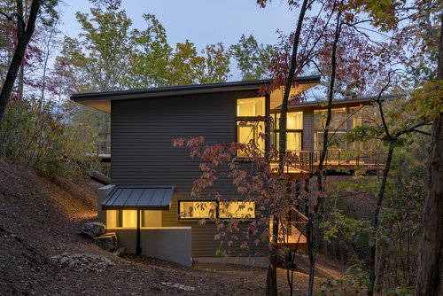
One of our favorite more recently designed and built homes is the one above by our friends at Samsel Architects. We love seeing WNC homes getting national design attention along with everything else we have to offer. Check out the online article HERE from our dezeen feed. Congrats!

— Kelly and Troy

In Situ Studio's Mid-Century Makeover

Our friends at In Situ Studio, a Raleigh based architecture firm who came and spoke in Asheville last year, made over this cool mid-century, modern home bringing it up to date for today's modern lifestyle. Enjoy some inspiration and take a closer look here. Cheers!

— Troy and Kelly

2017 Matsumoto Award Winners

Congrats to 2 of our local architects { and all the others} on their Jury Prizes in the Matsumoto Award competition last week in Raleigh. Scott Huebner of Brickstack Architects and Duncan McPherson of Samsel Architects won first and third places. Cheers to you!

HERE are the full results of the competition. Enjoy!

Modern Fans

Ceiling fans are always a topic of discussion when we tour homes with clients and one of the first things, along with light fixtures, to get changed out of homes to add a more modern aesthetic. Finding affordable options wasn't always easy, but finding options with clean lines is easier today. One of our modern news and shopping feeds sent us this link at 2Modern. We thought they pulled together a nice assortment of options. So, stay cool as you stay cool in your home. Cheers!

— Kelly and Troy

Saturday, June 4th | Asheville Modern Home Tour Teaser

Hi Folks! We are only a few days away from our 2nd Annual Modern Home Tour. If you haven't purchased your tickets please go here. You can, also, come to our social the night before and we will help you get tickets. In the meantime here is a quick peek at what is in store for you. You don't want to miss it. Cheers!

The Barnard house by Form and Function Architecture captures the expansive views of the Blue Ridge Parkway to the north and creates a secluded rear buffer. The house is a modern example of a traditional southern archetype of the dog-trot, with the primary sleeping and living areas divided by an entry vestibule.

The Butler Mountain home by Wilson Architects was conceived as an “L” shaped plan that hides the three car garage and defines the entrance courtyard. Landscaping and a fountain frame the entry path which leads to an all glass foyer. The foyer immediately highlights the mountains beyond and is equipped with pocketing doors that open to a gathering porch. All of the interior living spaces were designed to open to the exterior with large expanses of sliding glass. In the living room, doors fully pocket behind the fireplace to give an unobstructed view, and in the kitchen, doors open to a covered cooking and dining porch. The program required two main level master bedroom suites which are situated at either end of this central living and kitchen area.

The Nantahala Mountain home by Bach Design Studio is a mix of minimalistic detailing juxtaposing raw wood, against white walls with tall glass panes, and simple furnishings gives this rustic contemporary home its character. Terraces which surround it create a platform for multiple outdoor leisure spaces sheltered from the weather and with gorgeous views. The spaces weave in and out, framing panoramic views of the mountains and lake to blur the boundaries between inside and outside. This unique house brings back memories of the owners’ home living in Denmark and Atlanta by joining two living and building traditions into an experience.

The Dunkirk residence by Wilson Architects was built on a steep infill lot in the Kenilworth neighborhood of Asheville. The slope was circumvented with a 9’ wide pedestrian bridge that accesses the entrance. Glass entry doors open to the living space and double height windows frame the view of the trees behind the house. Additional bedrooms and living space are on the lower level, which walks out to wooded trails to the south of the home. The exterior is clad in stucco with shiplap wood siding accents around the entry. The steel floor framing is exposed throughout the main level, giving the home a slight industrial feel. The white oak floors were made from trees on the site along with several of the wood counters.

The Merrill's Cove by John McDermott features a light space with a floor of polished concrete that sets the stage for gallery style living while absorbing the sun to keep the cool space warm. Rich handcrafted details of ash and oak are used sparingly with plenty of white space to keep the eye uncluttered. The natural beauty of the home veils the mechanics making it near Net Zero in efficiency using both passive and active solar for energy and heating. Further heating and cooling are supported by geothermal heat pump and a wood stove.

Perdue Place by Rusafova-Markulis Architects was design in direct response to site constraints — the home's footprint is restrained by the site's set backs and the windows are carefully placed to frame views of the beautiful city forest. Inside, the home feels like a tree house as the trees around it are just a foot away and the large windows create a powerful connection between exterior and interior. Outside, the rich patina of the corten steel veneer panels blends the house into the lush green of the trees.

The West Chapel by Brickstack Architects was, also, designed in direct response to the extreme conditions imposed by the site. In an effort to both mitigate disturbance to the site as well as create a house that lives primarily on one level, and is easily accessible to the street, the house is entered via a timber and steel bridge. The main body of the house makes generous use of structural steel that cantilevers the structure out over the landscape, allowing the natural site to run freely below the house. Large expanses of glass blur the line between interior space and the tree canopies seemingly mere feet away. To take full advantage of the beautiful natural setting, the house features a dynamic outdoor living porch that is cantilevered 16’ beyond the main living space and 30’ above the landscape. The structural steel is a celebrated and expressive element of the design.

Sunday Morning Modern

A Round House from the Sixties | Thanks for our community members for sending us this fun little video. It truly captures the heart of those who live and breathe the nuances of a unique, mid-century home. Most people would assume that a dream home in the 1960s and a dream home today would be quite different. But, for Desiree Meyers and Julien Goldklang their dream home is a 1967 time capsule.

The 1,250 square foot Nolan House just happens to be round with a quirky zig zag roof! The designer of the house, Leon Meyer, produced many buildings, but only a handful of his round homes are still standing, and this may be the most well-preserved. Filled with vintage and mid-century furniture, the couple has gone the extra mile to make sure that the decor is spot-on 1967 authentic. Picking only the most iconic and well-made pieces (since they are furniture dealers) the home reads like a catalog of the best of the 60s. A veritable time capsule, the owners say the house “is kind of like stepping back into time.”


Under Construction | Urban Infill Modern Home

Here is a progress peek at Roost's latest project under construction near UNCA where infill lots have been snatched up over the past year. We love how the opposing wood and metal volumes define interior and exterior living spaces much like the lower level parking court is carved out of the earth and defined by concrete.

Looking forward to a more detailed tour soon. Nice job David!

UNCA Architecture Tour | Lipinsky Hall

Built in 1964 | Designed by Six Associates

This building was constructed as the campus's first student union. The hall was named for local businessman and community leader Louis Lipinsky. A trustee of Asheville-Biltmore College, A UNC Asheville predecessor institution, Lipinksy was instrumental in generating support for the 1958 and 1961 bond referenda which funded the move from Seely's Caslte to the present site of the campus.

A special thinks to Kevan from Asheville By Foot for my personal tour of UNCA and helping gather information on the campus. Cheers!

— Troy